排行榜 统计
  • 文章总数:1688 篇
  • 评论总数:5 条
  • 分类总数:8 个
  • 最后更新:一天前

Website Shape Divider: An Amazing Design Feature for WordPress

本文阅读 0 分钟
首页 常用工具 正文

Today we are excited to introduce Elementor’s new Website Shape Divider – a new refreshing design feature that will transform your pages and help you create beautiful and professional looking designs.

Here in Elementor, we not only follow top design trends, we also set them. Shape Divider is a perfect example of that, as it broadens the range of design possibilities considerably and allows you to create cool separator effects, that until now were simply not possible.

We really fell in love with this feature. So much so, that we decided to release it to the entire Elementor community, and not just to pro users.

We are starting off with 18 shapes you can choose from. These are starter shapes, that can be customized to create an endless and versatile array of dividers for your WordPress websites.

Here they are:

shape divider 900
Website dividers by Elementor

How Shape Divider Works

The Shape Divider feature uses highly optimized SVG shapes, that are manipulated and customized on our frontend editor.

When we developed this feature, we had two important guidelines we focused on: making sure the shapes were lightweight and optimized, while delivering shapes that looked great on any screen, resolution and device.

Besides making the shapes lightweight SVG files, we have also made their loading asynchronous, meaning they only load when you need them to, and after the page has finished loading, so it doesn’t affect page speed.

Because the shapes are SVGs, this guarantees they are always seen as high resolution, including on retina screens.

Control Over Shapes

Flexibility is an important factor when creating shapes. In Elementor, you have control over the various settings that help customize each and every shape:

shape-example-1

Background: You can separate any background with shapes, including color, image, video and gradient backgrounds

shape-example-4

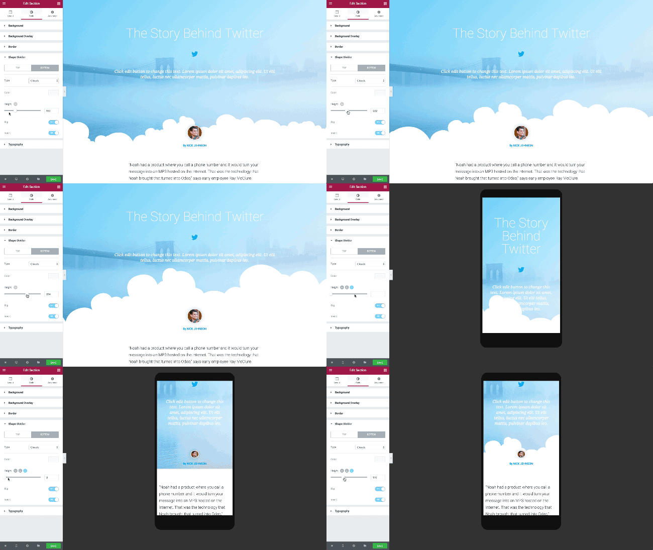
Controls:With the Shapes feature, you can control the size of the shapes, as well as invert them or flip them over

shape-example-3

Top & Bottom Shapes:Set a different shape for the top and bottom part of the section, with a separate set of controls for each side

elementor-shapes-mobile

Mobile editing:You can quickly customize a different shape to fit desktop, tablet and mobile screens, using Elementor’s Mobile Editing feature.

tiny free templates

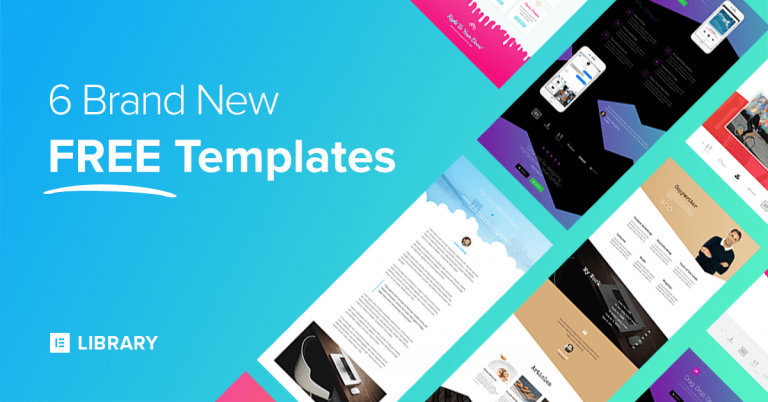
6 Shape Divider Templates to get you started!

We want you to get the fastest introduction into the shapes feature. This is why we’ve created 4 stunning FREE templates, that showcase a few creative ideas for using shapes. If you’re a Pro user, you get 2 more shape templates that are no less stunning.

You are invited to use these templates for your own website, and tinker with the shapes to get to know just how easy it is to use.

Other Improvements

Because the new shapes feature is so substantial, we won’t elaborate much on the other features added to Elementor this week. Hopefully, we will be able to publish a longer post depicting them in more detail further ahead.

In the meantime, here is a quick update on all the other improvements added to Elementor with this release.

Video Lightbox –You can now add a video lightbox modal, so when the user clicks on an image, the video opens as a lightbox. You can visually control various design settings of the lightbox. To see the video lighbox feature, make sure you add an image overlay to your video widget. 

Button Shadow –We added box shadows to Elementor back in July, and if I am not mistaken this feature is still only available on our builder. Now, you can also add shadows to buttons. How cool is that?

Smooth Scroll –A few months ago, we introduced smooth scrolling to our anchor widget. This way, you can create a one-page navigation that moves from section to section smoothly. Now you can use an ID to add smooth scrolling to any Elementor element: section, column or widget, without having to use the Anchor widget.

Icon List Dividers –As per many of our users’ request, we have now added the ability to separate the different list items with lines and spaces, and design the line style however you like. We have also fixed an issue where list items which were longer than one line wrapped around the icon instead of getting aligned one below the other.

Optimization Improvement –Without getting too technical, We’ve made sure JS scripts are included in the page only if you are using them. This means that your page only loads the widget JS scripts it needs, making Elementor pages load even faster.
Note: If you’re a developer, follow this code example to understand how it works.

Conclusion

Shape Divider has been added to a list of features we have added since the beginning of the year to the Free Elementor Page Builder, including Revision History and Gradients.

We invite you to take the new Elementor version for a spin, and share some of your creative shape divider pages with us.

Looking for fresh content?

Get articles and insights from our weekly newsletter.

Ben Pines

Product Evangelist & Senior Product Marketing Manager. Building websites seems like the dream job, and it is, but you have to know much more than technical skills. My mission at Elementor is to teach web creators how to build a successful business they love. 

本文来自投稿,不代表本站立场,如若转载,请注明出处:https://typecho.firshare.cn/archives/150.html
免责声明:文章内容不代表本站立场,本站不对其内容的真实性、完整性、准确性给予任何担保、暗示和承诺,仅供读者参考,文章版权归原作者所有。避免网络欺诈,本站不倡导任何交易行为。如您私自与本站转载自公开互联网中的资讯内容中提及到的个人或平台产生交易,则需自行承担后果。本站在注明来源的前提下推荐原文至此,仅作为优良公众、公开信息分享阅读,不进行商业发布、发表及从事营利性活动。如本文内容影响到您的合法权益(内容、图片等),请及时联系本站,我们会及时删除处理。
-- 展开阅读全文 --
国内银行收取 Google Adsense 电汇,2022年最新教程
« 上一篇 08-29
个人博客如何选择 Typecho 和 Hexo ?
下一篇 » 08-29